Strength and Imbalance- A Comparison of European Leagues
Ford Bohrmann
How can we effectively compare the strength of different European Leagues? Which country has a stronger top flight, England or Spain? Which country has a more balanced top flight, Italy or Germany? How does the imbalance and strength of the EPL change across the different divisions? These questions are not easily answered, and do not even necessarily have definitive answers. With the help of data from Euro Club Index and Infostrada Live (powered by HyperCube) we can begin to make some analysis of Europe's top leagues.
The idea for this post originally came from another blog post written by Chris Anderson (@soccerquant), the writer of the Soccer By the Numbers blog. In this post, Chris compares both the strength and imbalance of 6 of the top European leagues. You can read the post here. My idea was to expand upon this analysis using the extensive and accurate Euro Club Index data, while also looking at more European leagues. This analysis looks at the top leagues of 10 different European countries. The analysis will be split in to two posts. The first looks at only the top division of 10 different countries. The second, which will be posted later, will compare strength and imbalance within each country's league structure.
Methodology
Strength and imbalance are both tough to measure. While many measures exist, the Euro Club Index analysis provides an accurate measure of the strength of each European club. To find the strength of the different European leagues, I averaged the index value of each club in the top division. Each value is taken from mid-February of each year. This average represents the strength of each league. To measure the imbalance of the league, I calculated the Gini Coefficient of all the clubs in the country's top flight. The Gini Coefficient is basically a measure of dispersion (or in this case imbalance) that is usually used to measure the dispersion of income across a sample. Calculating it is somewhat complex so I won't go in to it here, but if you're curious here is an explanation. A higher Gini Coefficient indicates more imbalance in the league.
Below is a graph representing both strength and imbalance of 10 different European leagues. The y-axis represents imbalance, with a larger y value indicating more imbalance. The x-axis represents strength, with a larger x value indicating more strength. Ideally, a league is both strong and balanced. These leagues are, hypothetically, the most exciting to watch.
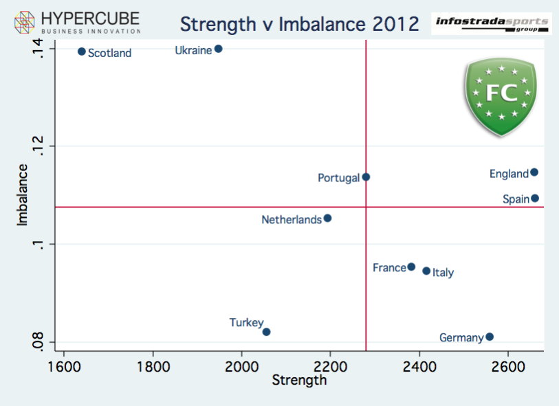
From the graph, we can divide European leagues in to 4 categories:
- Imbalanced and Weak: These leagues are theoretically the least exciting. They are likely highly predictable, but also not very strong. From the graph, we see that Ukraine, Portugal and Scotland are both of this type.
- Imbalanced and Strong: 2 countries fall in to this category: England and Spain. From the graph we can see that, while the English Premier League and La Liga are both very strong, they are also highly imbalanced. This is something you might expect.
- Balanced and Weak: These leagues are less predictable, but also are not that strong. Turkey and Netherlands fall in to this category.
- Balanced and Strong: This last category is the best of both worlds. The clubs in the league are very strong, but the league is also balanced. France, Germany and Italy all fall in to this category.
Clearly, these are just general categories, as some leagues are stronger or weaker of varying degrees. A lot of leagues are also on the edge of some of the average dividers, including Portugal which is slightly weaker than the average league.
Historical Context
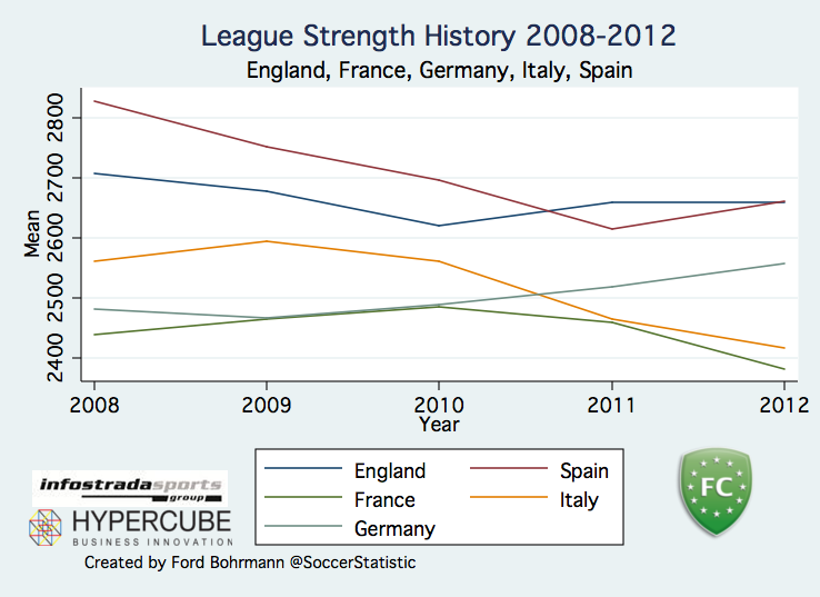
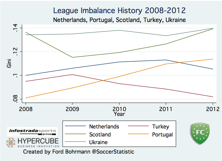
After this analysis, I was curious to see how the imbalance and strength of different leagues have changed over time. To check this question, I graphed the imbalance and strength values of each of the 10 countries over the past 5 years. These graphs show us how leagues have progressed. For the sake of understanding the graphs more easily, I have split the 10 countries in to two parts. The first is the "top" of the 10 European countries (England, France, Germany, Italy and Spain), while the second is the "bottom" of the 10 (Netherlands, Portugal, Scotland, Turkey, and Ukraine). This is just done so that the reader can see the changes over the years more easily.
Below is the graph of the measure of league strength from 2008-2012. You can see that not much change has happened. England momentarily surpassed Spain as the top European league in 2011, but Spain has now retaken a narrow lead in 2012. Additionally, Germany and Italy have switched places in terms of strength. There has also been a slight decline in strength of the top leagues in the past few years. Spain and Italy have both declined somewhat, whereas England has remained relatively constant.
Next is the same graph as above, but for the "bottom" 5. This graph is even more constant than above. The only change is that Ukraine has surpassed Scotland in strength. The strength levels of each league have also remained relatively unchanged. There have only been small fluctuations.

What about the progression of league imbalance? The graphs of imbalance levels over the past 5 years are shown below. First, France, Italy, and Germany have all kept a low level of imbalance over the past 5 years. On the other hand, England and Spain have had some interesting fluctuations. Spain has seen a consistent increase in imbalance over the past couple of years, while England has been on somewhat of a decline since 2008. However, this year the EPL has reversed this decline and become more imbalanced. This makes sense, as the influx of money in to the EPL quickly raised the level of imbalance. Ever since then, it seems that the EPL imbalance has slowly been declining. For the bottom 5 leagues, there hasn't been too much of a change in imbalance except for Portugal, which has seen a constant increase in imbalance since 2008. In 2008, Portugal had the least imbalance of any of these European leagues. Now, the Primeira Liga is somewhat in the middle in terms of imbalance.

Conclusion
As Chris points out in his analysis, this kind of work could give clubs insights in to how transfers will fare moving between leagues. For example, can we predict how well a top player in Ukraine will play in Spain? Similarly, which is better: 10 goals in the EPL or 15 goals in the Eredivisie? These questions are near impossible to answer, but this sort of analysis helps us. Knowing both the strength and imbalance of a league is important for evaluating players between leagues.
The next step for this analysis is to look at how different divisions of leagues vary. What is the differing strength and imbalance from the top division in a country to the bottom division? This sort of analysis can help a club determine how a player in a lower league might fare in a higher division, a question similar to the one I try to answer here.
Data provided byInfostrada Sports from theEuro Club Index(powered byHypercube). You can follow both Infostrada Sports accounts on Twitter:@InfostradaLive,@EuroClubIndex.