World Cup Performance by Continent (Lots of graphs)
Ford Bohrmann
Much has been made of the inter-continental games so far this World Cup, especially considering the presence of 3 of the 4 CONCACAF countries making it past the group stages, including the US getting out of the group of death and Costa Rica going much farther than anyone predicted.
To see how various (FIFA defined) continents have done compared to past World Cup results, I used past World Cup data collected from 11v11.com. I looked at the past World Cup results (here is an example from the United States’ page http://www.11v11.com/teams/usa/tab/stats/comp/978). These results include all World Cup and World Cup qualifying games, which is what I limited my analysis to. World Cup qualifying games are a little different than World Cup games, but considering these are almost always between countries that are in the same continent, I think its OK because I drop intra-continent games anyways. What defines a continent is pretty hazy, so I just stuck with FIFA’s definitions. This means that Australia is actually a part of Asia, and some other anomalies. This division of the world is the best way to stay consistent, though. The continents I ended up using were Africa, Asia, CONCACAF, Europe, Oceania and South America.
If you want to look at the code I wrote to do the analysis (the data scraping, the actual analysis, and the visualization) head over to here https://github.com/fordb/wc-continent-headtohead
There’s nothing too crazy going on in the analysis, just a lot of graphs to look at.


Each one shows how each individual continent has historically fared against every other continent. I focused on just GA per game and GF per game because this can be compared no matter how many games have occurred between each continent. GA and GF are also a little more representative than wins, losses and draws. Nate Silver preferred GF/GA for this reason when he created his Soccer Power Index.
From these, it’s clear that Europe and Brazil have historically dominated. Oceania is a little bit of an outlier just because of how few countries from there qualify for the World Cup. It seems like Oceania teams have dominated CONCACAF teams in what limited games have occurred between them. We probably can’t infer much from the small sample size, though.
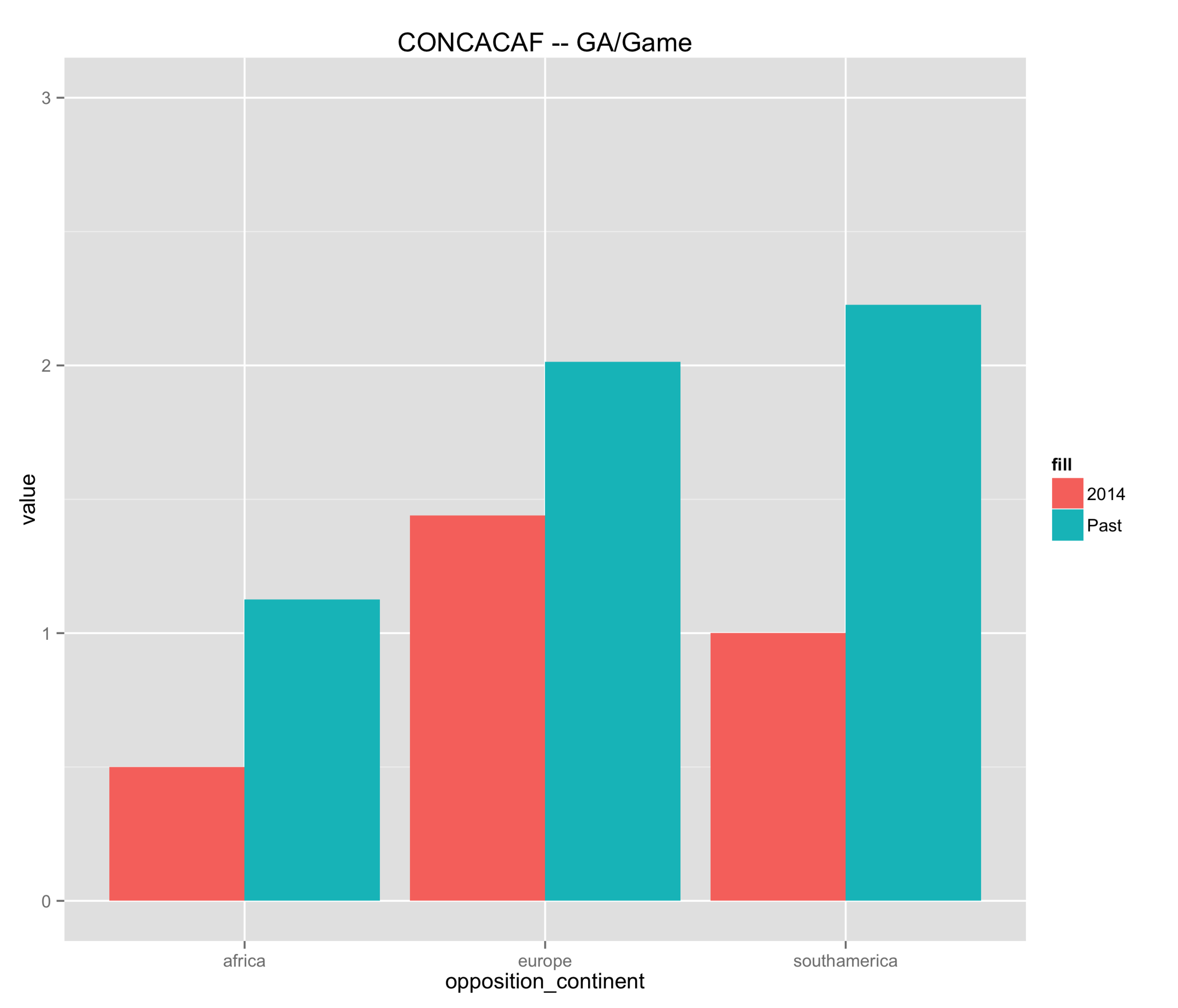
CONCACAF teams have historically scored just under 1.5 goals per game against European teams, and closer to 1.4 goals per game against South American teams. This compared to giving up 2 and just over 2 goals per game, respectively.
How does this compare to this year’s World Cup? To compare I made another set of graphs, this time comparing each continent’s historical GF per game/GA per game vs. their GF per game/GA per game in this World Cup.
CONCACAF countries did not actually score that much more compared to the past. They fared a little better against African and South American countries, but were about level with their past results against European countries. However, their GA per game dropped significantly this World Cup. The CONCACAF’s (relative) success this World Cup came from better defense. This isn't that surprising, especially with Costa Rica.

European countries really struggled scoring goals compared to their historical average, while staying about the same in GA per game.


South America has been dominant and continued to stay dominant. The only drop they had in scoring was against CONCACAF countries, which is what I mentioned earlier.


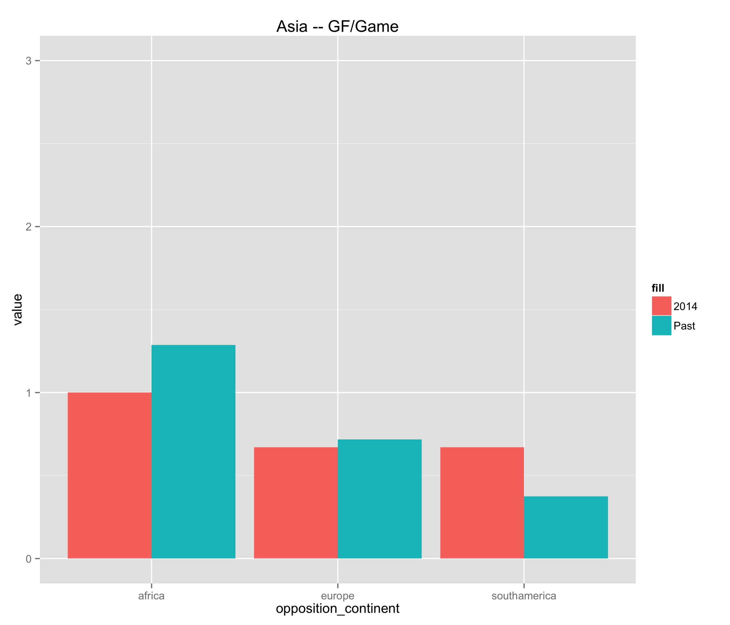
Asian countries stayed about on par with their previous performances, although this was already fairly poor.

African countries gave up more goals, but was about on par with their past goal scoring.


It’s important to keep in mind that while these graphs are interesting, the results from this World Cup should be taken with a grain of salt. There are not a large number of games, which means that we might see some strange goals for or goals against averages. So while something may seem to be a big change from previous results, it could just be from the fact that there were only 1 or 2 games between countries from two continents.