Contact Us

Use the form on the right to contact us.

You can edit the text in this area, and change where the contact form on the right submits to, by entering edit mode using the modes on the bottom right. 


123 Street Avenue, City Town, 99999

(123) 555-6789

email@address.com


You can set your address, phone number, email and site description in the settings tab.
Link to read me page with more information.

Blog

Filtering by Tag: ggplot

World Cup Performance by Continent (Lots of graphs)

Ford Bohrmann

Much has been made of the inter-continental games so far this World Cup, especially considering the presence of 3 of the 4 CONCACAF countries making it past the group stages, including the US getting out of the group of death and Costa Rica going much farther than anyone predicted.

To see how various (FIFA defined) continents have done compared to past World Cup results, I used past World Cup data collected from 11v11.com. I looked at the past World Cup results (here is an example from the United States’ page http://www.11v11.com/teams/usa/tab/stats/comp/978). These results include all World Cup and World Cup qualifying games, which is what I limited my analysis to. World Cup qualifying games are a little different than World Cup games, but considering these are almost always between countries that are in the same continent, I think its OK because I drop intra-continent games anyways. What defines a continent is pretty hazy, so I just stuck with FIFA’s definitions. This means that Australia is actually a part of Asia, and some other anomalies. This division of the world is the best way to stay consistent, though. The continents I ended up using were Africa, Asia, CONCACAF, Europe, Oceania and South America.

If you want to look at the code I wrote to do the analysis (the data scraping, the actual analysis, and the visualization) head over to here https://github.com/fordb/wc-continent-headtohead 

There’s nothing too crazy going on in the analysis, just a lot of graphs to look at.

Read More

Power Laws and Goal Scoring

Ford Bohrmann

Is there a normal number of goals scored in a season for a striker? To answer this, one may be tempted to just take the mean of the goals scored of every player in a season. If we do this for last season, the mean is 1.83. Of course, this is misleading. There isn't really such thing as a "normal" number of goals scored in a season. The reason for this is that goals scored does not have a standard distribution, the bell curve we are used to. For example, if you looked at the distribution of heights in a population, you would see a nice bell curve. Most people are right around the average height, and as you go towards the extremes either way (really short or really tall) you find fewer and fewer people. Therefore, the mean of heights in the population is instructive because it gives us the "normal" or "typical" height. The problem is, goals scored in a season does not follow a standard distribution. Instead, most players score no goals at all. The next most common number of goals scored last season? Just one goal, of course. This distribution continues, and it follows a power law distribution.
Read More

Visualizing Twitter Data

Ford Bohrmann

twitter-soccer-bird.jpg

Inspired from this post on plotting the frequency of Twitter hashtags over time, I was interested in trying to apply this to soccer some way. While not the most technical analysis, I thought it would be interesting to use this tool to analyze transfer rumors.

To summarize the process quickly, there is a package in R (open source statistical software) called TwitteR which allows you to pull Twitter data. It's actually a fairly easy process, especially if you follow the tutorial in the link at the beginning of this post.

As most Twitter users know there is a seemingly unlimited number of transfer rumors circulating Twitter. These range from being fairly plausible to pretty ridiculous ("Ronaldo to the Philadelphia Union???).  As a Manchester City supporter, I was curious at looking at a few popular transfer rumors related to City.

Robin van Persie to Manchester City:

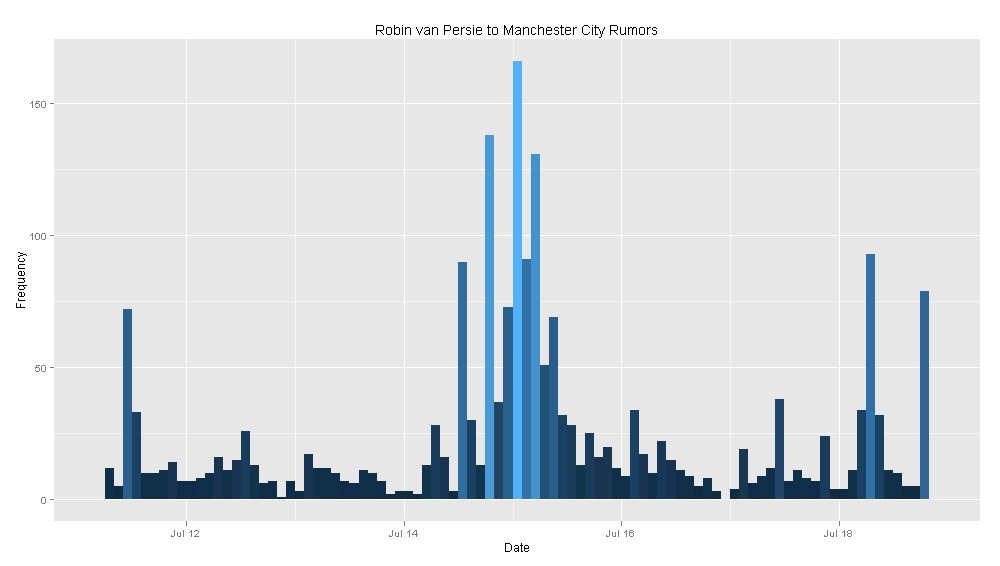
Yes, this is definitely a rumor, and yes, it is probably not going to happen. But I was still curious. Below is a plot of the frequency of the number of tweets that include "Robin van Persie" and "Manchester City". Of course, this is an imperfect method, but it still gives us an idea of what is going on in the Twitter transfer rumor world.

rvp.png

To explain, the graph below measures the number of tweets described above at a 2 hour interval for the past week. This means the height of every line gives us the number of tweets referencing RVP and City in that 2 hour interval.

Carlos Tevez to AC Milan:

After Tevez's past season with the club, there are obviously transfer rumors concerning Tevez all over the place. Because of this, it was hard not to want to look at the data on Tevez. I picked AC Milan because it seemed like the club he had the highest likelihood of going to. Like above, I searched for tweets that included "Carlos Tevez" and "AC Milan". The frequency of these tweets, in 2 hour intervals, is plotted below.

tevez.png

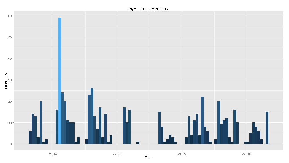
You can try to analyze these graphs to find some meaning, but they are more just a fun exercise than anything else. The TwitteR package lets you do other cool things, like plot the frequency of Twitter mentions for a user. I did this for another site I write for, EPL Index. They tend to get a lot more mentions than @SoccerStatistic does, so I thought it would be more interesting to plot the frequency of @EPLIndex mentions. Again, the intervals are every 2 hours.

eplindex.png

Like I said before, this analysis is not very insightful or ground-breaking, but still pretty cool nonetheless. The possibilities for future analysis like this are almost endless, so if people have good ideas of Twitter data to visualize, I'd love to hear them.