Contact Us

Use the form on the right to contact us.

You can edit the text in this area, and change where the contact form on the right submits to, by entering edit mode using the modes on the bottom right. 


123 Street Avenue, City Town, 99999

(123) 555-6789

email@address.com


You can set your address, phone number, email and site description in the settings tab.
Link to read me page with more information.

Blog

Valuing The MLS SuperDraft

Ford Bohrmann

The draft can be a valuable tool to build a successful club in MLS. When expansion teams come into the league they are automatically given the top draft picks. The list of players that entered MLS through the draft is telling. Some of the top goal scorers: Clint Dempsey, Taylor Twellman, Edson Buddle, Brian Ching. Some of the players with the most minutes: Nick Rimando, Brad Davis, Nick Garcia, Brian Carroll. The list goes on.


Some of these players I’ve mentioned were top picks. Brian Carroll was selected 2nd overall in 2000. Taylor Twellman was selected 2nd overall in 2000. Some of the top players who were chosen in the draft were selected in the later rounds, but went on to very successful careers. Chris Rolfe was selected 29th overall. Davy Arnaud was selected 57th overall and scored 54 goals in his career.

On the flip side, there are a number of notable draft busts. Nikolas Besagno was selected 1st overall in 2005 and went on to play in only 8 games. Joseph Ngwenya went 3rd overall in 2004 to Salt Lake and scored 18 goals in his career, while Salt Lake passed over Clint Dempsey, Clarence Goodson and Michael Bradley.

This post aims to provide some context around the value of draft positions. This can be helpful for determining a fair trade (“Should I trade up to a higher selection?”) or looking at how clubs have performed in their draft selections (apparently the Rapids have done a pretty crappy job overall).

Read More

Outcome Probability Calculator is back up!

Ford Bohrmann

After about a month of downtime I have the outcome probability calculator back up and running. Shiny (made by RStudio) is great but they decided to start charging so I rewrote it all in Python. I used Bokeh, which is great. If you're trying to do some data visualizations online it's a great way to go. The formatting looks a bit different but the data and models are exactly the same. Check it out here.

If you want to see how I created the models, check out this post.

And if you haven’t seen the Economist blog post from a couple weeks back comparing Messi to Ronaldo using the data, read it here

A lot of people have reached out to me asking for the data or have been trying to manually gather it from the applet. If you’re interested in using the data then just reach out to me at soccerstatistically@gmail.com and I’d be happy to send all the raw data to you, provided you reference this blog when you use it. 

Finally, now that the calculator is fixed I can focus on some other work I’ve been doing. I’ve admittedly been absent from posting here for a while. I have a few posts I’ve been working on recently, so expect some new stuff coming soon...

World Cup Performance by Continent (Lots of graphs)

Ford Bohrmann

Much has been made of the inter-continental games so far this World Cup, especially considering the presence of 3 of the 4 CONCACAF countries making it past the group stages, including the US getting out of the group of death and Costa Rica going much farther than anyone predicted.

To see how various (FIFA defined) continents have done compared to past World Cup results, I used past World Cup data collected from 11v11.com. I looked at the past World Cup results (here is an example from the United States’ page http://www.11v11.com/teams/usa/tab/stats/comp/978). These results include all World Cup and World Cup qualifying games, which is what I limited my analysis to. World Cup qualifying games are a little different than World Cup games, but considering these are almost always between countries that are in the same continent, I think its OK because I drop intra-continent games anyways. What defines a continent is pretty hazy, so I just stuck with FIFA’s definitions. This means that Australia is actually a part of Asia, and some other anomalies. This division of the world is the best way to stay consistent, though. The continents I ended up using were Africa, Asia, CONCACAF, Europe, Oceania and South America.

If you want to look at the code I wrote to do the analysis (the data scraping, the actual analysis, and the visualization) head over to here https://github.com/fordb/wc-continent-headtohead 

There’s nothing too crazy going on in the analysis, just a lot of graphs to look at.

Read More

Underdogs and Inefficiencies

Ford Bohrmann

Odds makers tend to do a fairly good job in sports-- While they may not be perfect, it tends to be tough to find any consistent exploitable inefficiencies. In other words, it is rare that the odds of "Liverpool winning at home", or some other event like that, are consistently over or underestimated. You may think that the odds in an individual game may be incorrect, but in the long run inefficiencies like that rarely persist. Why? Because bookies would lose money on them. If they realize they are starting to lose money, the odds are going to be adjusted to better reflect the probability of each result occuring.

While I am not really interested in betting on soccer myself, odds do provide an interesting estimate of the probability of an outcome occuring. For example, take Arsenal's home game against Chelsea this past year. Bet365 put the odds of an Arsenal victory at 2.38. These decimal odds imply that they expect the probability of an Arsenal victory to be about 42%. Taking in to account that the odds makers usually lower the payouts so that they make money, the adjusted probability of an Arsenal victory is just over 41.1%.

This is all pretty standard stuff. The odds for relatively evenly matched games like the one above are probably pretty accurate, or at least more accurate than your average person. But what about significant underdogs? What about City against Cardiff? These are a little more difficult to assess. It's clear that Cardiff is an underdog in this game, but how much of an underdog? And do odds makers do a good job of assigning implied probabilities to these lopsided games?

Read More

Sloan Sports Analytics Conference Overview: The State of Analytics in Soccer

Ford Bohrmann

The Sloan Sports Analytics Conference was this past weekend. I attended the 2012 conference and was looking forward to seeing how much the soccer analytics community had progressed. Unfortunately, the soccer panel was very similar to the one two years ago. While I'm not quite as pessimistic as Howard Hamilton, I understand where his viewpoint is coming from. I think the reason for this lack of progress in the soccer analytics community is threefold:
Read More

The Numbers Game: My Thoughts

Ford Bohrmann

I just finished The Numbers Game: Why Everything You Know About Soccer is Wrong, and really enjoyed it. I've been lucky enough to meet Chris at the MIT Sports Analytics Conference, and have also met a number of the other people featured in the book. I even played pickup soccer last summer in New York City with Ramzi Ben Said, the Cornell undergrad tasked with collecting some of the data for the book. All in all, the names that come up are very similar to the names on my Twitter timeline. If you're reading this blog and have read the book, you probably recognize a lot of the names also.
Here are some of my thoughts:
Read More

Goal Time Analysis

Ford Bohrmann

If you had to place a bet, at what minutes do you think the most goals are scored during the course of a soccer game? I was asking myself this exact question, so I decided to try to figure out what the answer was. If scoring is completely random we would expect the distribution of the count of goals scored to be roughly even across every minute of the game. Of course, it is not going to be perfectly distributed because of random errors, but every minute should have roughly the same number of goals, assuming the sample is large enough. I had a hunch that this would not be the case. Specifically, my guess was that there would be more goals scored between the 85th and 90th minutes, whereas there would be fewer in the first 5 minutes of the game. To test this hypothesis, I used data from the Rec.Sport.Soccer Statistics Foundation page from 8 years of the Premiership.
Read More

Power Laws and Goal Scoring

Ford Bohrmann

Is there a normal number of goals scored in a season for a striker? To answer this, one may be tempted to just take the mean of the goals scored of every player in a season. If we do this for last season, the mean is 1.83. Of course, this is misleading. There isn't really such thing as a "normal" number of goals scored in a season. The reason for this is that goals scored does not have a standard distribution, the bell curve we are used to. For example, if you looked at the distribution of heights in a population, you would see a nice bell curve. Most people are right around the average height, and as you go towards the extremes either way (really short or really tall) you find fewer and fewer people. Therefore, the mean of heights in the population is instructive because it gives us the "normal" or "typical" height. The problem is, goals scored in a season does not follow a standard distribution. Instead, most players score no goals at all. The next most common number of goals scored last season? Just one goal, of course. This distribution continues, and it follows a power law distribution.
Read More

Momentum in Bolton vs. Manchester City

Ford Bohrmann

Now that some of the advanced data set has been released by Manchester City's performance analysis department it's a good time to start delving in to the data to see what kind of analysis can be done. Although the advanced data set is only for one game-- Bolton vs. Manchester City from last season-- there is still A LOT of data to look at.

The advanced data contains (x,y) location information of every statistic that is kept. This is valuable information, as it obviously tells exactly where each event happened in the game. I was interested in how this information can be used, specifically to look at momentum and passing trends.

Previous Work

Some work has already been done in the soccer analytics community on trying to quantify and analyze momentum. The Analyse Football looked at momentum shifts from this same game, although in a different way. The Soccer by the Numbers blog looks at momentum in football in a much more general way.

Read More

Dealing with the MCFC Analytics Advanced Data Release

Ford Bohrmann

I wanted to point out an excellent blog post from the blog Professor Pepper's Assistant.

If you're an R user and are having trouble dealing with the Advanced MCFC Analytics XML data file, the link above provides the code to pull the data in to a data frame in R. After this it is easy to perform whatever analysis you want on it.

I'll admit the code above is beyond my limited R skill level, but I know that it works. I'm excited to start doing some analysis, although the advanced data set is only for one game from last season at this point.

A Simplified Football Prediction Model

Ford Bohrmann

I recently wrote a blog post for the Betting Expert site about a simple model I created attempting to predict the outcome of football matches using only very simple statistics.

You can read the full blog post here.

I wanted to point out on here something interesting that I found while working on the model; betting odds do a relatively poor job of predicting football match outcomes. In other words, the percentage likelihood of a win, draw and loss for the home team implied from the odds set by bookmakers is surprisingly inaccurate.

My hypothesis for why this happens is that football is very unbalanced, especially in the EPL. It is very hard to predict when an upset is going to happen, mostly because these upsets are (seemingly) random.

Using just 4 factors in my model, including the home team's goal differential for the season up to that game, the away team's goal differential for the season up to that game, the home team's point total from the previous season, and the away team's point total from the previous season, I could create a model that was as accurate as the bookmakers.

The question that remains is how much more accurate can the model become with the introduction of new variables? Beyond that, what variables should be used?

I am not sure I know the answers to those questions, but I am going to keep playing around with the data.

Visualizing Twitter Data

Ford Bohrmann

twitter-soccer-bird.jpg

Inspired from this post on plotting the frequency of Twitter hashtags over time, I was interested in trying to apply this to soccer some way. While not the most technical analysis, I thought it would be interesting to use this tool to analyze transfer rumors.

To summarize the process quickly, there is a package in R (open source statistical software) called TwitteR which allows you to pull Twitter data. It's actually a fairly easy process, especially if you follow the tutorial in the link at the beginning of this post.

As most Twitter users know there is a seemingly unlimited number of transfer rumors circulating Twitter. These range from being fairly plausible to pretty ridiculous ("Ronaldo to the Philadelphia Union???).  As a Manchester City supporter, I was curious at looking at a few popular transfer rumors related to City.

Robin van Persie to Manchester City:

Yes, this is definitely a rumor, and yes, it is probably not going to happen. But I was still curious. Below is a plot of the frequency of the number of tweets that include "Robin van Persie" and "Manchester City". Of course, this is an imperfect method, but it still gives us an idea of what is going on in the Twitter transfer rumor world.

rvp.png

To explain, the graph below measures the number of tweets described above at a 2 hour interval for the past week. This means the height of every line gives us the number of tweets referencing RVP and City in that 2 hour interval.

Carlos Tevez to AC Milan:

After Tevez's past season with the club, there are obviously transfer rumors concerning Tevez all over the place. Because of this, it was hard not to want to look at the data on Tevez. I picked AC Milan because it seemed like the club he had the highest likelihood of going to. Like above, I searched for tweets that included "Carlos Tevez" and "AC Milan". The frequency of these tweets, in 2 hour intervals, is plotted below.

tevez.png

You can try to analyze these graphs to find some meaning, but they are more just a fun exercise than anything else. The TwitteR package lets you do other cool things, like plot the frequency of Twitter mentions for a user. I did this for another site I write for, EPL Index. They tend to get a lot more mentions than @SoccerStatistic does, so I thought it would be more interesting to plot the frequency of @EPLIndex mentions. Again, the intervals are every 2 hours.

eplindex.png

Like I said before, this analysis is not very insightful or ground-breaking, but still pretty cool nonetheless. The possibilities for future analysis like this are almost endless, so if people have good ideas of Twitter data to visualize, I'd love to hear them.

Possession Analysis: A Closer Look

Ford Bohrmann

There is no shortage of analysis done recently on the fact that possession statistics tend to be misleading. A while ago, I looked at how teams with higher rates of possession in the MLS do not tend to win more games. Similarly, the Climbing the Ladder blog on the MLS website recently did analysis and found very similar results. Devin Pleuler (@devinpleuler) has done even more analysis on why possession stats are misleading for his Central Winger blog on the MLS website. On his personal blog, Devin has also looked at possession efficiency and how it relates to winning. Even more, the 11tegen11 blog (@11tegen11) has written about some interesting points on how to better analyze possession. I'm sure there are even more that I have forgotten to list here, but you get the point.
Read More

Strength and Imbalance- A Comparison of European Leagues

Ford Bohrmann

How can we effectively compare the strength of different European Leagues? Which country has a stronger top flight, England or Spain? Which country has a more balanced top flight, Italy or Germany? How does the imbalance and strength of the EPL change across the different divisions? These questions are not easily answered, and do not even necessarily have definitive answers. With the help of data from Euro Club Index and Infostrada Live (powered by HyperCube) we can begin to make some analysis of Europe's top leagues.

The idea for this post originally came from another blog post written by Chris Anderson (@soccerquant), the writer of the Soccer By the Numbers blog. In this post, Chris compares both the strength and imbalance of 6 of the top European leagues. You can read the post here. My idea was to expand upon this analysis using the extensive and accurate Euro Club Index data, while also looking at more European leagues. This analysis looks at the top leagues of 10 different European countries. The analysis will be split in to two posts. The first looks at only the top division of 10 different countries. The second, which will be posted later, will compare strength and imbalance within each country's league structure.

Read More

EPL Table Visualization: A Different Perspective

Ford Bohrmann

After the positive comments and interest in the scoreline visualization chart I posted last week, I decided it would be interesting to do another type of data visualization. Processing, the software I've been using for these visualizations, lets you do some cool stuff with making the visualization interactive. This week, I decided to make a more complete and informative visualization of the English Premier League table. 

I tried to make it as stand-alone as possible. In other words, I wanted people to understand it just by looking at it without other information. One point: its interactive in that you can scroll your mouse over a club's circle and it will give you information on them. If you are interested in more analysis and how I created it, read below.

Read More

Scoreline Visualization

Ford Bohrmann

The idea for a scoreline visualization originally came from Devin Pleuler (@devinpleuler on Twitter). He had the idea to create a graph that represents how soccer scorelines tend to progress, representing both how often scorelines end a certain way, and how often games flow through a certain scoreline.
Using data from 1000 EPL games from the RSSSF, I've created this chart using Processing, which you can find below.
Read More

New Site!

Ford Bohrmann

I've redesigned the Soccer Statistically site! Instead of using Blogger in the domain name, the site is now www.soccerstatistically.com, which is nice. I've also redesigned the entire website with a new banner design. Here are some of features on the site:

Blog: The blog is exactly the same, and is the also home page of the site. Nothing new here.

Statistical Applets: There is now a menu option called Statistical Applets. Under this are two options, Expected Points Added and Outcome Probability Calculator. The first is a table of the EPL leaders in Expected Points Added, a metric I created a while ago that takes in to account the true value of each goal when ranking goal scorers. For more information, you can read here. The Outcome Probability Calculator lets you enter information about a team in a game, and then gives you the probability of each type of outcome. For example, you could enter the 34th minute, at home, leading by 1, and see the probability of the team winning, drawing, and losing.

About Me: Just an about me page, with a contact us form link.

If you have any comments or suggestions on the design for the new site, I'd love to hear him. I'm working on adding some more statistical applets to that section for the future, which I'm excited about. Hope you like it!

Problems with an Adjusted Plus Minus Metric in Football

Ford Bohrmann

Michael Essien

What would be the perfect, all-encompassing football statistic? Something that takes in to account both offensive and defensive skill. Something that measures what value a player adds to his club. All in all, a statistic that quantifies the individual impact a player has on improving (or worsening) his club's ability to score goals and limit (or not) goals against.

Some people have made attempts at this in the past. One example are OptaJoe's tweets (@OptaJoe) about club's winning percentages with and without a player. Here is one example: "10 - Since January 2005, Everton have averaged 61 points per season with Arteta playing, compared to 51 points without him. Lynchpin." These statements are simple, easy to understand, and at first glance seem to be informative. On his blog 5 Added Minutes, Omar Chaudhuri has correctly pointed out that these statements tend to be entirely misleading. As Omar shows, the problem is that these statements are not controlling for the strength of the opponent, the venue of the game, or really anything else, in these games.

My idea was to create a metric that would control for all of these factors to truly understand every player's worth to their club. Being a big ice hockey fan (specifically the Boston Bruins, if you are wondering) I thought that the plus minus statistic might be able to be applied to football. For those of you not familiar with this statistic, plus minus basically measures a club's net goals when that player is on the ice/field. When the team scores a goal when the player is playing, the player's plus minus increases by one. Conversely, when their team concedes a goal when they are playing, their plus minus decreases by one. The idea is that, over the season, the best players will have the highest plus minus.

I faced the same problem as before though, as this does not control for the strength of the opponent, the strength of the team the player is playing with, and where the game is being played. For example, a poor player on a top club would naturally have a higher plus minus than a good player on a poor club.

To fix this, I applied an analysis used in basketball to create an adjusted plus minus statistic. This was created by Dan Rosenbaum, and if you are interested the explanation can be found here

Without going in to too many technical details, the adjusted plus minus metric is created using a massive regression. The right hand side variables are variables for every player, while the left hand side are goals for. Each observation is a unit of time during a game where no substitutions are made. Each player variable is a 1 if the player is playing at home during that unit of time, a -1 if they are playing away, and a 0 if they are not playing. The significance behind this methodology is that it controls for each player's team, venue, and opponents. If you want to know more about the methodology, read the link above. The data is from the 2010/2011 season and is provided by Infostrada Sports  (@InfostradaLive on Twitter).

The main problem with this as some, including Albert Larcada (@adlarcada_ESPN), pointed out on Twitter, is that there is multicollinearity in the regression. This arises because, unlike in basketball, there are not many scoring events. What happens is that many players are highly correlated in the model. This throws off the adjusted plus minus values for each player, so we should not take anything from the results.

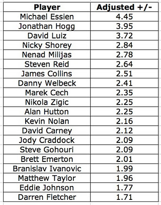
With that in mind, here are the results that I came up with. Again, these results are likely not correct, but I thought people might be curious to see them anyways:

Because I (a) spent a lot of time on this and (b) think it is important post work even if it doesn't necessarily work out, I went ahead and wrote this post. Keep in mind that the results above don't really mean much. The values are also not statistically different from 0. In other words, the standard errors on all the values are large enough so that we cannot say that they are statistically different from 0. This is another reason why the results are not very reliable. However, I think that the adjusted plus minus statistic could be the first step to creating metrics that truly capture the actual value of a player. Most statistics used (assists, goals, etc.) can be thrown off because they are highly dependent on the team the player plays for.

One way to fix the problem of mulitcollinearity is to use a different statistic that occurs more often, and is highly correlated with goals. I think the best option for this would be shots on goal. This way, you could create a statistic that controls for the player's team, opponents, and venue, and measure how many net shots on goal occur when they are on the field. Just a thought on a possibility of something to look at in the future.

The data used for this is provided by

Infostrada Sports

 (@InfostradaLive on Twitter). Special thanks to Simon Gleave (@SimonGleave on Twitter) for helping me with the data.

How to Succeed in the EPL: Chances Created and Chance Conversion

Ford Bohrmann

A common statistic that many people have begun to value and notice a lot recently is the chances created statistic. Chances created, according to Opta's website, is defined as "assists plus Key passes" where a Key Pass is "the final pass or pass-cum-shot leading to the recipient of the ball having an attempt at goal without scoring" (Opta is a company that tracks and generates a ton of data in soccer). So basically, any pass that leads to a shot is considered a chance created.

Swansea's Mark Gower is a perfect example of a player highlighted by the chances created statistic.

Chances Created

The appeal of this measure is that it can value players that play on weaker teams better than assists do. For a player on a weaker team, it is harder to record assists since they are playing with teammates that are less likely to score. Chances created is a fairer statistic because it does not value the strength of your teammates as much. Overall, it can highlight creative players that are often overlooked because they are on weaker teams and do not have as many assists.

Do Chances Created Actually Matter?

With all this in mind, I was curious to find the actual worth of the chances created statistic. One way to measure this is to look at how chances created and wins are correlated. To make it a little easier, I looked at the relationship between goals scored and chances created for EPL teams. In other words, do teams that have more chances created score more? Do teams with less chances created score less? The answer, in short, is yes, they are correlated. Below is a scatterplot of the relationship. There is a clear positive relationship between chances created and goals in the EPL last season. The coefficient is statistically different than 0 (p=.000), which tells us that there is extremely strong evidence that there is a positive relationship.

Chance Conversion Percentages

This is only half the story though. Some teams get a lot of shots off, but either because they are not good at shooting or are taking shots that have a smaller chance of going in, some of these teams have a low number of goals because they have a poor conversion percentage for shots. The conversion percentage is defined as the goals divided by the total number of shots (excluding blocked shots). Below is a scatterplot similar to the one above, this time with conversion percentages on the x-axis. The conversion rates are rounded to 2 decimal places, hence the bunching. Again, this shows a positive relationship between conversion percentage and goals. Teams with higher conversion rates tend to score more and vice versa. This relationship is also statistically different from 0 (p=.002). A quick note: the product of chances created and conversion rate is very close to the number of goals a club has scored. I'm pretty sure the discrepancy comes from including blocked shots in shots attempted, but not in conversion rates.

EPL 2010-2011, Chances Created and Conversion %

With this in mind, I created a scatterplot of conversion rates and chances created for EPL teams last season. The plot shows that clubs found scoring success in different ways. The Manchester clubs did it by being efficient scorers; they had conversion percentages of .15 and .16. Chelsea and Tottenham were on the other end of the spectrum with higher chances created, but lower conversion percentages (.12 for both). The graphic also shows that West Ham did not struggle because they were not creating chances; they struggled because they had a low conversion percentage (.10). On the other hand, Birmingham struggled because they failed to create enough chances to score, despite a decent conversion percentage of .12.

EPL 2011-2012 thus far, Chances Created and Conversion %

What about this year? Below, I created the same scatterplot as above, this time for the current season. City's dominance is really highlighted. They are leading in both chances created AND conversion percentage, hence the massive number of goals this year. Again, United seems to be scoring because of their high conversion percentage. QPR and United actually have very similar number of chances created, United just finishes their chances with a much higher percentage. Liverpool sticks out because of their high number of chances created, but really low conversion percentage (.09).

Conclusion

The bottom line is that creating chances and conversion rates are the key to understanding goal scoring. A club can succeed with a high conversion rate (United) or by creating a lot of chances (Liverpool). A club can really dominate by doing both well (City). The graphic above can also suggest what kind of players each club needs. For example, Manchester United and Newcastle would benefit by picking up a creative midfielder who creates more chances, and Liverpool and QPR would benefit by picking up a more efficient scorer. The scatterplot also tells us why some clubs struggle. Wigan needs to up their conversion percentage (currently a dismal .06) and Stoke needs to create more chances. City, on the other hand, should just continue to buy all the best players.

All data comes from eplindex.com (@EPLIndex)